
The UI for CiC developed over the four years we worked on the series although by the second game, Drive on Moscow, it was pretty much set in stone with only minor changes to templates (about a days work) required to make the bulk of it ready for a new game. Naturally there was a whole bunch of game specific elements that took considerably longer but these were spread throughout the team.
So Battle of the Bulge went through about a year of pre-production and development and over this time the UI benefited from a lot of iteration. This was my first time making an interface let alone a touch screen one so there was a lot to learn and a lot of mistakes to be made. We obviously did something good as the resultant UI won us a Charles S Roberts award and a whole heap of praise from the press and public. That first Bulge version is now showing its age but the update for Moscow which was subsequently used for Desert fox, Arnhem and Stalingrad has stood the test of time.
Most of the process was outlined in a couple of blog posts on the Shenandoah site though I’ve copied them to this site.
Battle of the Bulge – Crisis in Command 1
iPad
The Bulge interface we eventually settled on was grey painted metal and a dark grey bakelite so as to blend in with the map. I didn’t want it to be too obnoxious but to effectively (rather than actually) fade into the background when you were concentrating on the map. I was also concious we were making a serious wargame and wanted to avoid garish, overly strong colours and contrasts. Buttons were sized so there was some visual feedback even for the fattest fingers and to allow the German of the equivalent text to fit. Anything the user could press was bevelled. That went for the obvious buttons, some interface panels and units.


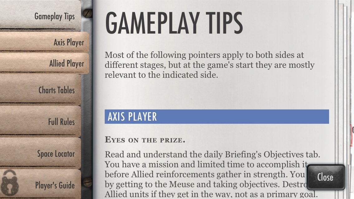
Combat Preview, History, Rules, Briefing
With hindsight the grey was a mistake. While it worked with the Bulge colour pallete, had suggestions of the awkward British utilitarian styling and technically was easy to change for different national factions, it wouldn’t work with Desert Fox or even Moscow. It was too specific. To an extent this was down to my belief that I’d be able to create a different interface for each theatre/extreme weather conditions .. so one that would work for the desert, one for Europe in the summer, one for winter etc.. As it was we never released enough theatre specific games for the time to be offset. Some games, like Moscow, covered from dry summer to snow covered winter so needed something generic and development time became increasingly compressed.
iPhone
Transfering CiC to iPhone was not a case of just resizing. Many of the dialogs contained too much text, pages had to be split and a slightly different visual language was used through out. The redesign was a collaborative effort on the part of my self and developer David Dunham and proved extremely successful with many of the lessons learned being utilised in future iPad designs.
Most of the solid iPad frames and panels were replaced with 9 patch translucent black. some in game panels such as the menu and combat preview still needed the solid black to aid readability.


Combat Preview, History, Rules, Briefing
Drive on Moscow – Crisis in Command 2
So when we started Moscow I took the opportunity to rework the interface so it was more generic, was more punchy, stood out more rather than trying to blend in and incorporated some things we’d learnt from the iPhone. I also created templates for everything so our new artist could simply change label colours to match the new factions. It worked well. So much so that when I came to do Arnhem all the faction specific work was done in less than a day. With a little more work on the templates and dev time I could of got it down to a few minutes. Unit icons (as seen on some panels), calendars, names and faces of generals etc. are subject to design so are rarely completed as quickly unless already defined.
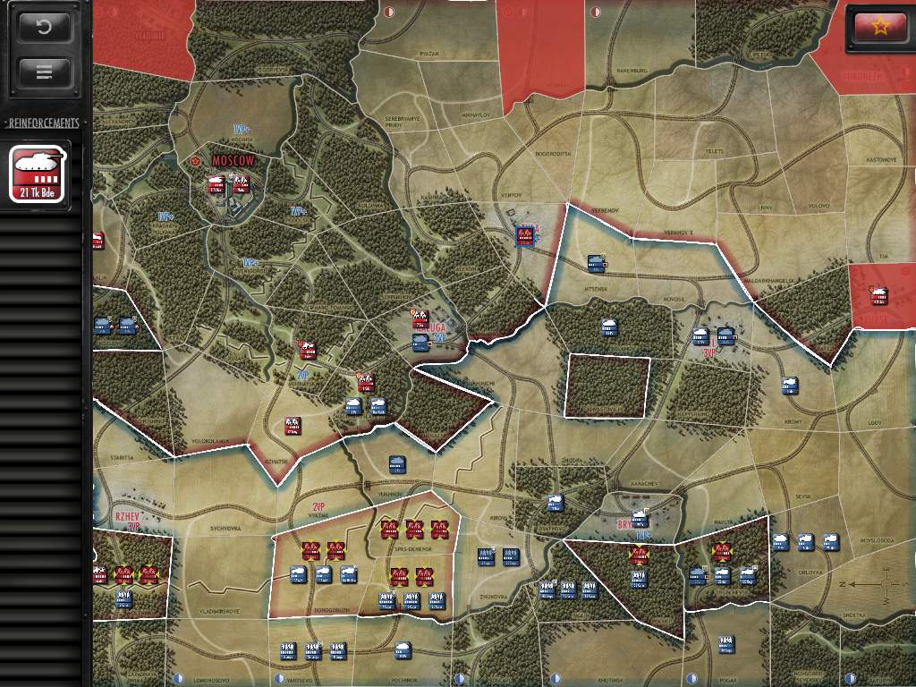
Grey has been replaced with black and the overall contrast has been increased. Many of the menu and panel layouts have changed considerably as have the HTML delivery methods. A degree of minimimalism and miniaturisation has occured with the map view .. obscurring less of the map.


Combat Preview, History, Rules, Briefing
Select Online Game, Selective Reinforcements, Replay
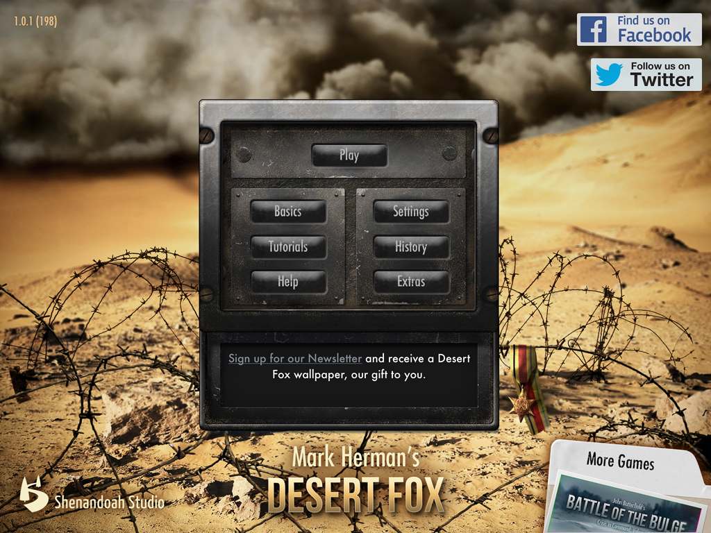
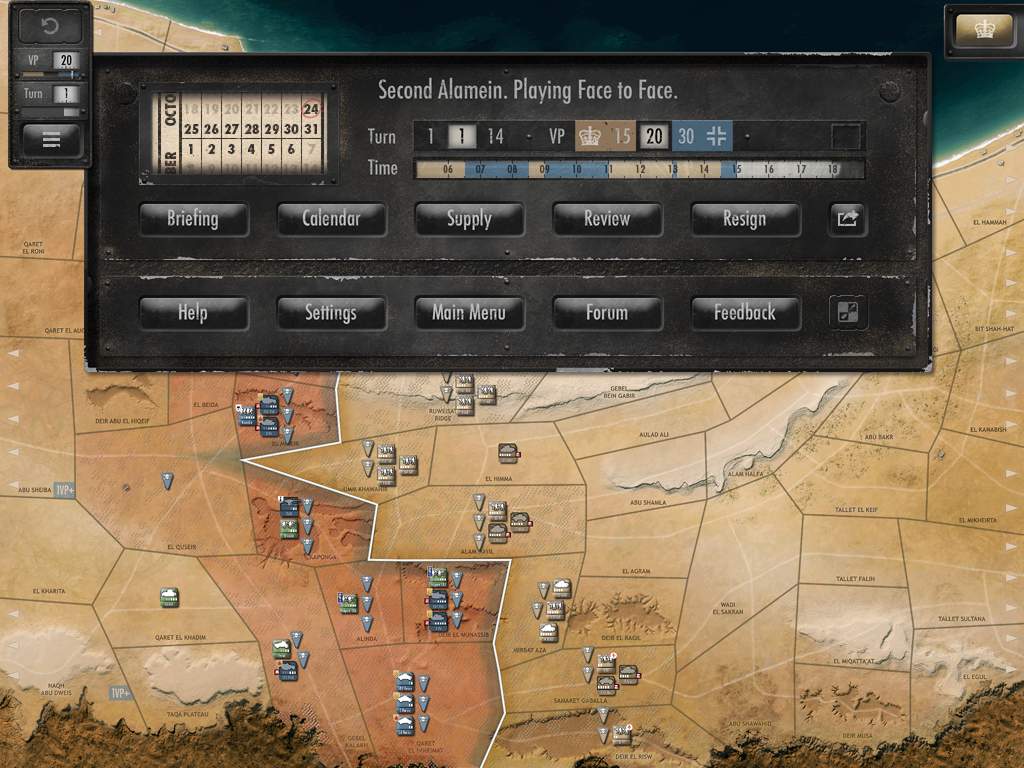
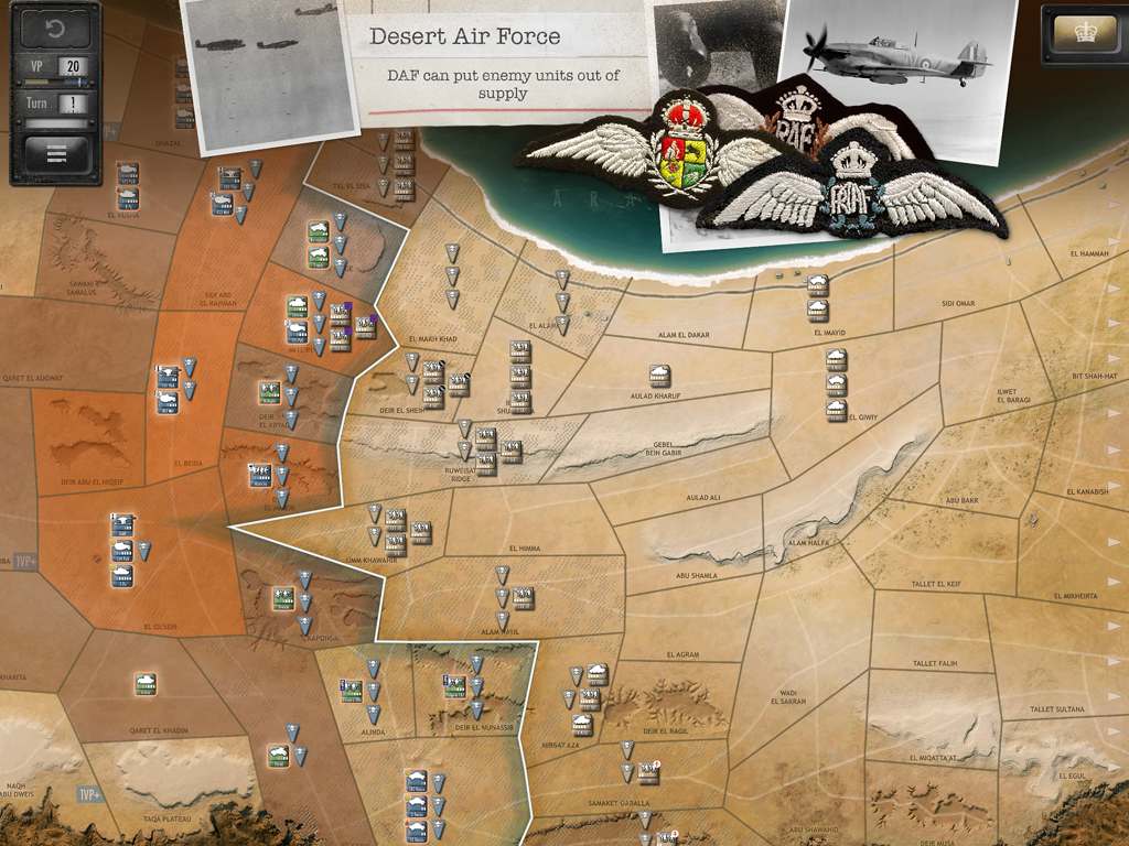
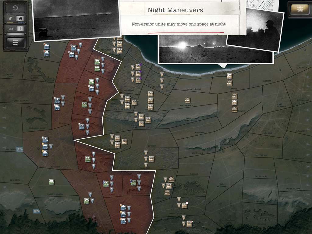
Desert Fox – Crisis in Command 3
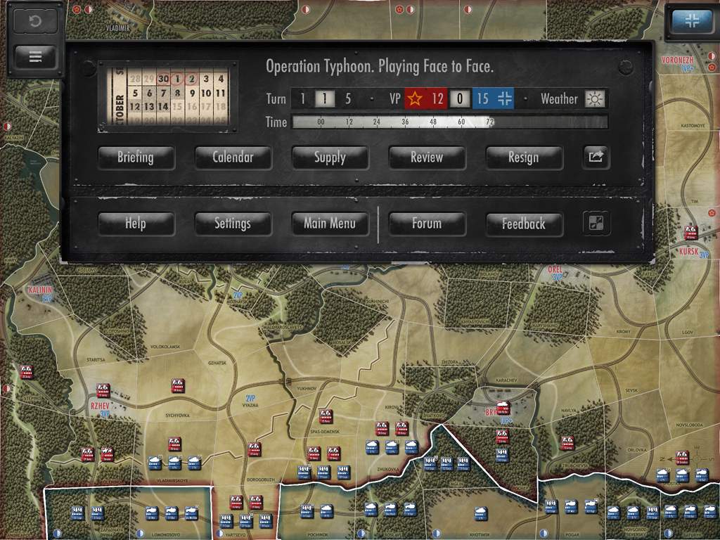
Desert Fox was the first real test of the UI asset development pipeline and was successful. So much so that I had extra time to go back and add some theatre specific nicities like the sand and dust. And like Moscow before it, we added more mechanics and the interfaces to deal with them. Notice that in the map view we’ve now reintroduced the more detailed panel with time, date, VP etc.. We found that, despite ‘taps being cheap’, players hated having to tap to see certain levels of information, such as ‘where in the game am I’ and am ‘I winning?’. We introduced different strengths of AI instead of just different traits and personalities and several new mechanics; mines, refits, night maneuvers, variable resupply, upgrades, and Anti aircraft influenced interdiction.


Combat Preview(s), History, Rules, Briefing
Create an Online Game, Assign Supply, Enemy Mine Fields, Air Interdiction and AAA
Night Maneuvers, Refit or Offensive
Market Garden – Crisis in Command 4
While the Arnhem interface elements were completed, they never made it into a working prototype so no screen shots exist.

![]()


Ideally non of the colours would of been baked into the panels but memory and dev time prohibited this. If they had been I could of created one master file for the colours and output them in seconds.
No Responses to “Crisis in Command UI”