
Way back before I did my first ever Conflict of Heroes: Awakening the Bear 2nd Edition map .. before I’d even approached ( unintentionally insulted … ) Uwe about doing them .. there was Guadalcanal. These maps gave me confidence in what I was doing for Awakening the Bear ( the Uwe didn’t show them to me until I was involved ) which was very highly informed by what I’d done for some VFX jobs .. that of producing miniaturised landscapes for game FMV.
But it wasn’t until I’d almost finished the First Men In maps, back in 2012, that I was asked to do some support work. At this point Awakening the Bear had been printed but I’d not seen a copy so I had no way to judge what the final artwork looked like compared to what I see on screen. ( The disparity can be frightening so its normal practice to get a printers proof before comitting to a full print run. I’ve never seen one of those )
It doesn’t matter what hardware or software you use or your level of experience or skill .. once it’s left you, you have no control and no input. With my being in UK, the printers being in Germany, client in America and my never seeing proofs, it was somewhat difficult to make informed decisions about whether the maps would maintain their colour, tone, detail or even print at all. I’d never had anything printed on such textured board before and had no idea of how to compensate and adjust for that technically and aesthetically.
As an example, compare the digital art on the left, with the printed ones on the right .. notice the difference in tone .. even between two boards of the same digital colour printed in the same run.
Unfortunantly that can be the nature of printing.
So I just want to re-emphasise that I didn’t do the Guadalcanal map artwork. I wouldn’t post at all except that it paved the way for my work on other games in the series and ultimately led me to Shenandoah and now Slitherine so I want to show it some love.
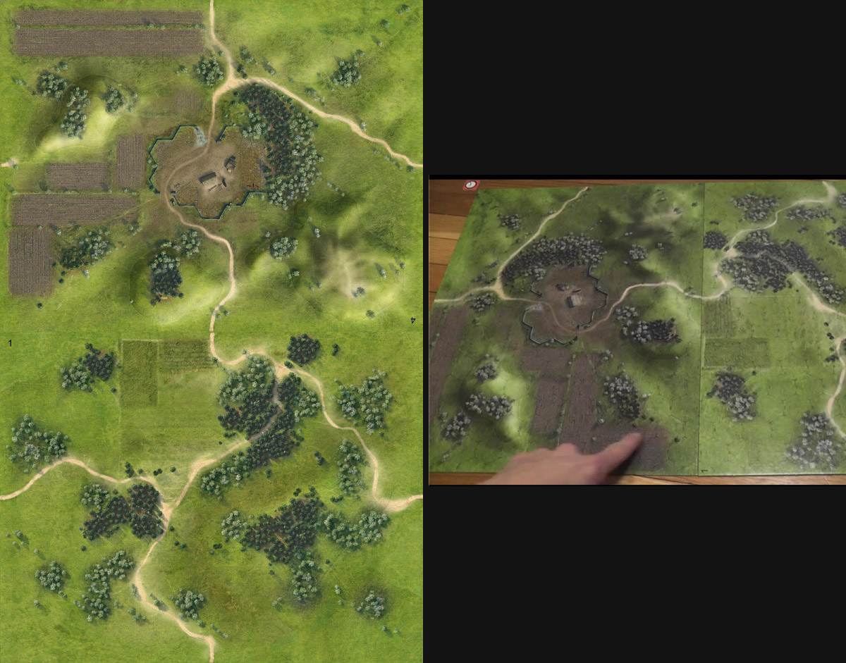
Pavlos had done an excellent job and I was barely involved, just being asked to remove the black forest shadows, add the new hexes we’d put in place for Awakening the Bear, and repaint some areas to work with new scenarios. I’m really quite in awe at the amount of detail he managed to get into these textures.
Lessons Learned from Awakening the Bear.
In working on Awakening the Bear (AtB – in 2010!) I’d tried to address a lot of usability issues that are inherent in realistic maps: readability of the differing terrain; legibility of hexes without them distracting from the artwork; excessive detail; too much realism; etc. etc.. Its always a balancing act. I didn’t get everything right and it wasn’t until several months after release that I saw a copy and realised we should of pushed some things a lot further.
Examples being the lines around hills which, despite popping in the digital artwork, just died when printed. As for the hex lines, the client had requested I avoid black in shadows so that the pure black, overprinted hex lines would still be visible. When I got my hands on the final game it was clear this was just not enough and the knock on was that the terrain as a whole suffered from a lack of punch the black inevitably provides.
Anyway, the first thing I was asked to do was to bring the shadows into line with AtB. Well, without access to the original artwork thats deceptively tricky. I tried to isolate the darkest shadows and kill the black without it impacting the rest of the map. After some careful masking it was done though it had the unwanted effect of reducing the readability of the different types of trees.
A year later, testing was mostly done, counters, designed, and manual being finalised, and it was now time for the fixes to the final artwork.
I was asked to put in the new AtB hexes and numbering. By now, I’d seen a copy of AtB so knew that it wasn’t enough to overprint the hexes on top of the art and needed some way to increase their contrast and legibility without drawing too much attention to them and ruining the aesthetic.
The approach I’d taken with AtB’s numbering was too time consuming for the budget and didn’t work with the hex lines, so I devised a more streamlined and automated approach. It was better than the AtB solution but, as appears to be the case now, still not enough when printed, more so because the artwork is so busy and the linen finish of the board can give the illusion of blurring and bleeding of tone.
I was wary of being overbearing with the technique because it wasn’t my map art and I was very conscious of the terrible white hex halos used on a now infamous LNL wargame that needs no mention. I’d always assumed they were not deliberate and were the result of an over exuberant attempt at the same thing I was trying to do so I was really concerned about pushing them too far. Turns out I should of been more concerned about not pushing it far enough.
Early on this year I was asked to change some of the hex numbering and repaint some of the overlays to suit changes in scenario design.
So all in all it was a project that was in production for maybe 5 to 6 years and which I was on the fringes of for maybe 4.
The reasons for the delay were primarily the development and incorporation of the new solo rules. Academy wanted to ensure their games would be as future proof as possible which required a lot of development time and simultaneous planning of multiple titles. Obviously the bottom line also required them to release other titles to ensure sufficient cash flow which contributed a little to the delay.
As a result the First Men In, Storms of Steel and Marsh maps have yet to be released. It’s hard to know what lessons will be learned from their printing but I’ve taken into account many of the gotcha’s AtB threw up in addition to many more new ones.
It’s now possible to compare the AtB boards with what I see on screen. I knew it would be darker and less saturated but the level of ink spread on the textured board and the disparity in ink levels between different boards was a big surprise, frankly depressing and something a proof should of shown up.
The artwork is now sharpened just enough so it should pop at normal table viewing level without it looking grainy. I’ve yet another technique for outlining hex lines that should improve readability without imposing on the map. Hill lines should be easier to read as should the centre dots. Of course should is the important point. When a project takes more than 4 years to get to print and several additions are created in the mean time, its difficult to incorporate the lessons learned from one project in the following, simply because you don’t actually know if they ARE improvements… test prints on textured photo paper only get you so far.
In the end, though circumstances may not allow you to make best use of it, experience really is the most valuable tool you have, because in the real world, it’s often all you’ve got to fall back on.
No Responses to “Conflict of Heroes – Guadalcanal”