
Battle of the Bulge for iPhone taught us a lot about the focussing of effort. With El Alamein being delayed while Nick and the team redesigned it, the developers decided to rebuild the engine and I changed the approach to the creation of graphics. To a large extent CiC is now based on templates that only need very minor changes per game. The main interface has been altered to a default black that can be used in any theatre. It was actually a huge amount of work but the result was that the only thing that ever changes is the national/faction colours so we can litterally have 99% of the interface up and running for a new game in a day or so. (Later on, and too late for development, I found a way to get away with saving out only 1 file. So a new game interface for about 5 minutes work!)
So here’s some examples of the new, black interface.


You can see above a lot of the new social media and game advertising that marketing wanted added.
The maps(s) for Moscow posed a whole new challenge. The original Bulge map had litterally months of preproduction and experimentation (though the final map you see was done in about a week once I’d worked out the approach). Moscow was working on a vastly compressed timescale. Somewhat like the curse of the second album .. we’d spent so much time developing El Alamein, only to decide it had to be reworked, that Moscow had to be out and in the hands of players within a few months. In fact my original estimate for Moscows art was 4 months (based on Bulge where I was a one man band designing and creating everything from HTML, intro movies, all the in games assets, all the interface and front end, marketing adverts, poster and website, liaising with printers, Kickstarter backers, reveiwers etc. etc.). I was told to reduce that to 3 months .. and then 1.5 and the quality had to be higher than Bulge. That was a lot of pressure.


I off-loaded all the HTML work to other members of the team, the intro movie was done by our new artist, Rob, as was the marketing, and I set about creating all the interface templates so that all he needed to do was add some coloured bars in appropriate places. After creating all the units it left me little more than a long weekend to create the 4 Moscow maps, each one a third as big again as Bulge so naturally there were one or two compromises and issues that so far have gone largely on commented on.
While the art and game itself was rewritten and reconstructed from the ground up, we did our best to ensure it maintained what CiC was about. It’s above all functional, attractive, evocative, interesting and has a military feel while hopefully avoids the clichés and characatures seen in so many WW2 themed games. We also introduced a bunch of new features.
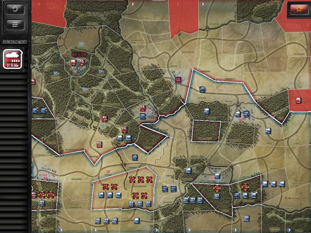
Here’s a collection of screen shots from the standard resolution iPad version of the game. The retina version is twice the resolution.


And these are from the iPhone release.


Again, like Bulge, Moscow has gained critical acclaim and a number of awards.
No Responses to “Drive on Moscow – iPad and iPhone.”