Not long after becoming a founding member and Art Director of Shenandoah Studio in about Oct 2011, I was tasked with three things; design the company logo, build the company website, and art direct our first game. This was both daunting and exciting. While I had a grand title, the reality of a small team is that I had an artists dream job. I got to do everything.
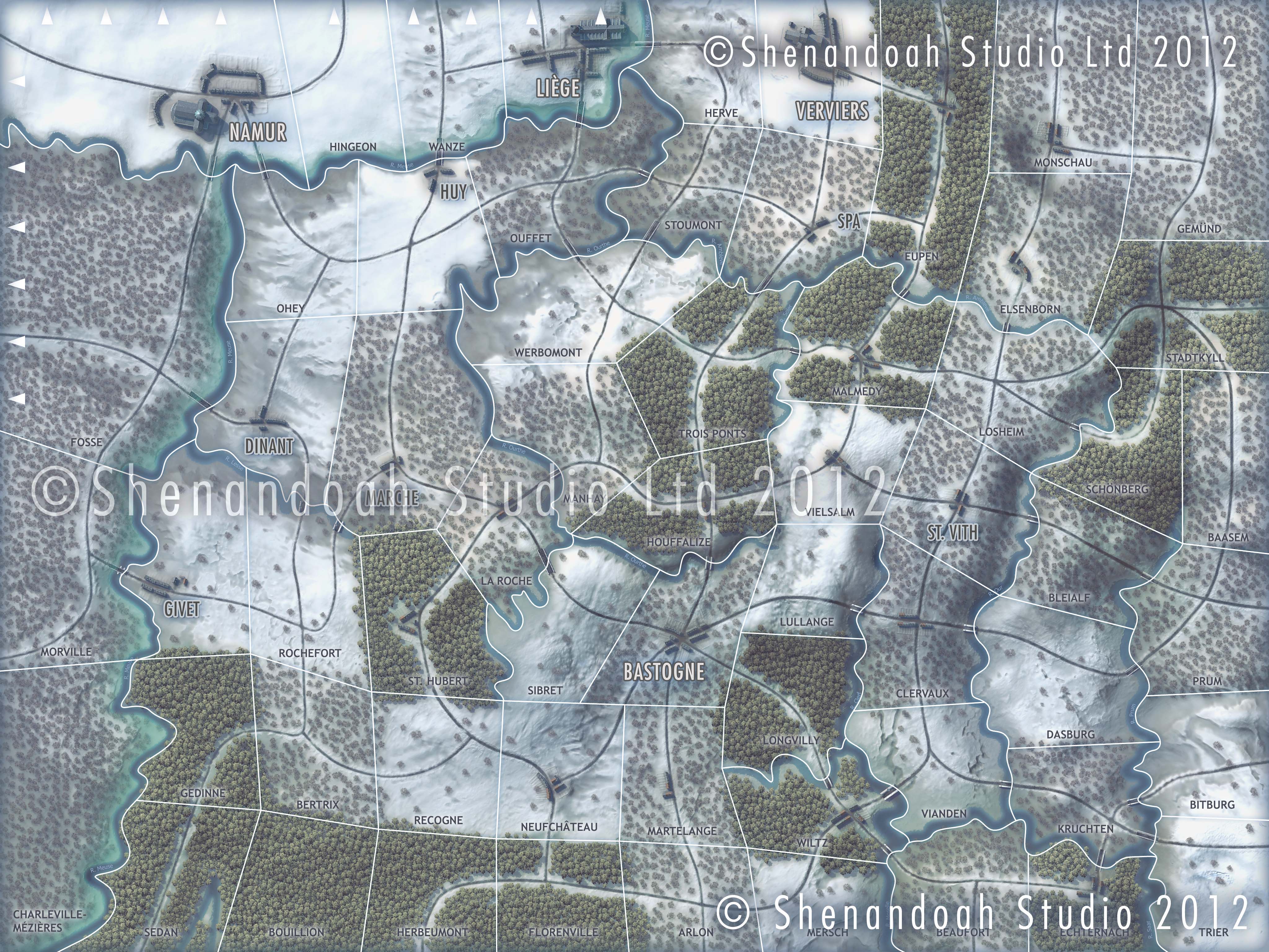
 But designing the look of a game from the beginning was not something I’d ever done before and the biggest hurdle proved to be how to nail down a look that would work for a series. In the past I’ve always been presented with concept art or the equivalent. So I started with the board game .. or rather the paper prototype game, that had been put together by John Butterfield.
This gave me the foundations, the functional map, the essential mechanics and information the player needed to play the game. John is an information designer and had already put a good deal of thought into what the player needed to know and when. This left me able to concentrate on the aesthetics, visual metaphor and usability. When creating any kind of boardgame art there’s a balance to be struck between functionality and decoration. Functionality has to be the prime concern but aesthetics have a very important role to play..
So the first thing to do was to play the game, work out what the player needed to be able to make a decision and research the Battle of the Bulge. I knew it was meant to be part of a series and so wanted to find a common thread. It struck me that the landscape played a big part in how this, and other proposed battles, had played out, expressed in the use of Areas to control movement rather than hexes. So the envirnoment would be emphasised in the techniques used to create the map and in the games general backgrounds.
http://vimeo.com/36077408
The map went through months of development. I spent a long time looking at other games and how they’d conveyed the essence of the Battle of the Bulge. Defining my own take on who failed, who succeeded and why, eventually deciding on our own look and presentation of information.

We then had to consider the player position. There was a lot of experimentation with presentation but the common metaphor was to present the player as a commander in the field, being passed infromation and orders on scraps of paper and ticker tape, communicating by radio, etc.. Not ground breaking but it gave us a legitimate reason to put some historical ephemera in there to add to the historical feel. Being a military history buff I’ve boxes full of medals, documents, letters, badges, books etc. to draw on and we’d always planned to include a lot of background information to the battle for those who wanted to know more about the events.
So the first thing you see when you start the game is the intro movie. This was a short introduction to the battle, the world events that lead upto it and an indication of where in the world its taking place.
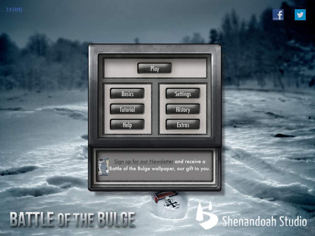
Here are some examples of the many interface panels for the front end. The styling was kind of a hybrid of British, American and German radios that I found during research and meant to have that slightly awkward, cobbled together, rough and ready feel that a lot of military design of the time had. (Much of that was down to materials, speed of design and practicalities .. big chunky interfaces to be used by people wearing big chunky gloves under stressfull conditions).
One of the things about war games is they can feel intimidating so we wanted to offer a number of different ways for people to to be able to learn the game. So throughout the game we show messages on ticker tape to explain what’s going on and the reasons certain things can or can’t be done. But before you enter the game you can either watch the videos in our YouTube Channel, read the five pages of absolute basics, go through a hand holding tutorial, or read the full blown rules with all the charts and tables that are being referenced behind the scenes.
These are some images of the Basics and the full Rules. The first provide enough for anyone to start playing. The later gives you absolutely everything about how the game works. The look was inspired by my grandads WW2 photo album and I laid all these out in HTML/CSS with background images, and animated screnshots. All copy written by another team member. The final image is of the shop where players could purchace extra AI opponents, scenarios and historical documents.
Some examples of the historical background information we’ve included. The layout was based on some WW2 magazines though we kept the font use consistent with that used throughout the rest of the game, Futura , Georgia and American Typewriter. I created all the HTML layouts, the maps and sourced and edited all the supporting photographs and illustrations. The copy was written by another member of the team.
The main game itself has a number of interface panels to convey or give access to multiple levels of information to allow you to make deeper and far reaching plans. Again we went through dozens of iterations, looking at ideal button positions for ease of use and the best position on screen to present information. We’d not designed for iPad before but realised very early on that to treat it like a PC or board game would be a grave mistake. The nature of the gameplay and the way you interact with it lead us to conclude that the two most important buttons had to be in the top left and right corners and assuming most players would be right handed should present little information on the right side or bottom. ( for a long time we planned on giving the player options for right or left handedness and colour blindness but like many features it got cut )
Once you’ve finished you’re given the option to run through your game via a realtime video. The original concept included a lot analytics and charts aimed specifically at the more hardcore gamers who enjoy this level of analysis. Sadly we ran out of time to implement it fully ans it was eventually dropped.
This is the original concept proposal. (Note this was never compressed to work over the internet so it may not run smoothly.)
http://vimeo.com/86280943
And a selection of adverts. Because we are primarily an iOS developer we couldn’t use Flash for the adverts and websites often had a limit of 99Kb per image so creating animated gifs became quite a challenge.


Battle of the Bulge was released in December 2012 on the AppStore. It did us proud, winning many online awards for best wargame, game of the week, game of the month and even game of the year. My personal favourite being the Charles S. Roberts Award for Computer Wargame Graphics.


If you want to read more about the development, head over to Shenandoah Studio or to read more detail about the art process check out the Art Diaries.


No Responses to “Battle of the Bulge – iPad”