Twighlight’s Last Gleaming (TWL) was the difficult middle child. While technically not part of a series, thematically, the War of 1812 sits between Rebels & Redcoats (R&R) and Gettysburg. As already mentioned on the Gettysburg page, America was still struggling to assert its independance from Britain and Europe. While it had made tentative steps to strike out on its own it hadn’t completely escaped the shackles of British domination and inteference.
At this time, Britain was embroiled in the Napoleonic War and with King George III ill and unable to rule, in his place was put his son, the Prince Regent. For Britain, the War of 1812 was a backwater skirmish. They neither lost nor won but simply contained it. For the Americans this was a highly significant step in their independence. For the Canadians it cemented their borders and for the Indiginous population it spelled disaster.
In R&R the Americans and British had an almost identical visual language, differentiated by the red, blue and minor decorative elements. In Gettysburg the Americans had developed their own. I wanted TWL to show that it was midway between the two. So the crisp paper and American fonts of Gettysburg were replaced with rough paper and the British fonts of R&R. ie. America was beginning to go off in its own direction but was still under the yoke of Britain and Europe. This was emphasised again by the use of Regency decoration dominating the top right of the map board (conveniently mimicing the North west position of Britain on a world map).
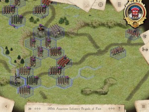
Below is the first pass.
So as well as the American paper and British font, the top right shows the Regency inspired element. While the American bunting is obvious (and only has 15 stars) the British one represents Britain, Canada and the First Nations. Britain and Canada were using the same flag and colours so the Union flag and the red, white and blue represent them. The eagle feathers represent the First Nations but you’ll also notice the blue and white belt near the bottom. This suggests a Wampum belt; the blue and white horizontal stripes represent the treaty between the Indians and the British/Canadians. It would of been very easy to simply have a Union flag but I felt it important to provide th eIndians with some representation.
However the client felt the use of paper was too similar to the Gettysburg look and not distinctly different enough for marketing. As this project had a very short deadline it was decided to instead expand on the Regency theme for the on-map view.
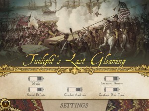
Above is the first screen you’re shown. The game name and background painting were standin as the final assets were to be supplied by the client. Again, to maintain consistency and clarity between games, the same menu icons designs are used.
As a long time member of the National Trust I’ve been to many large period houses and something that came to mind was room dividers/dressing screens that were covered in collage. It seemed an interesting contrast to the ornate Regency decoration and allowed me to integrate some historical/story/character elements.
Below are a selection of other front-end menus and pages.
Like Gettysburg, there were no campaigns so the Scenario page also contained the Scenario description and the difficulty setting. The American medals were similar to those in R&R as historically there had been no movement though I added the bunting to the gold. For the British medals I used British and Canadian regimental flags for bronze and silver and for gold, the Kings Crown and two Indian axes. Again the paintings used for the scenarios are standin and would be provided by the client.
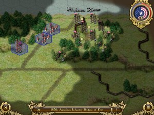
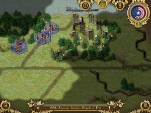
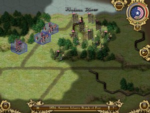
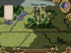
In the on-map view, the paper was all replaced by elaborate Regency themed artwork.
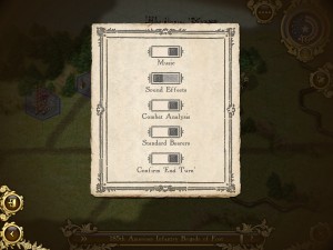
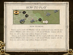
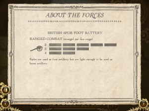
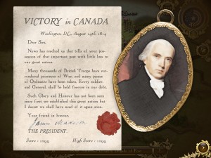
And below are a selection of in-game menus. The letters and portraits were deliberatly understated to convey the lack of fanfare.










No Responses to “Twilight’s Last Gleaming UI”